PSIQUÊ
Visual identity for a multidisciplinary psychology clinic: logo, applications and brand guidelines.
- Type
- Visual identity (reinterpretation)
- Role
- Graphic designer
- Deliverables
- Logo, applications and guidelines
- Tools
- Illustrator, Photoshop and InDesign
- Images
- 7
BRIEF
- CLIENT
A multidisciplinary psychology clinic, with professionals from different fields working in the same place.
- REQUEST
A modern, minimalist logo that, in the client’s words, would “look like an app”.
- COLORS
Purple and yellow were mandatory: they are colors that matter to the client.
- REINTERPRETATION
This case recreates the project for the portfolio. Name, logo and pieces are new and are not the material delivered to the client. The texts in the images are in Portuguese.
HOW I ANSWERED IT
- SYMBOL
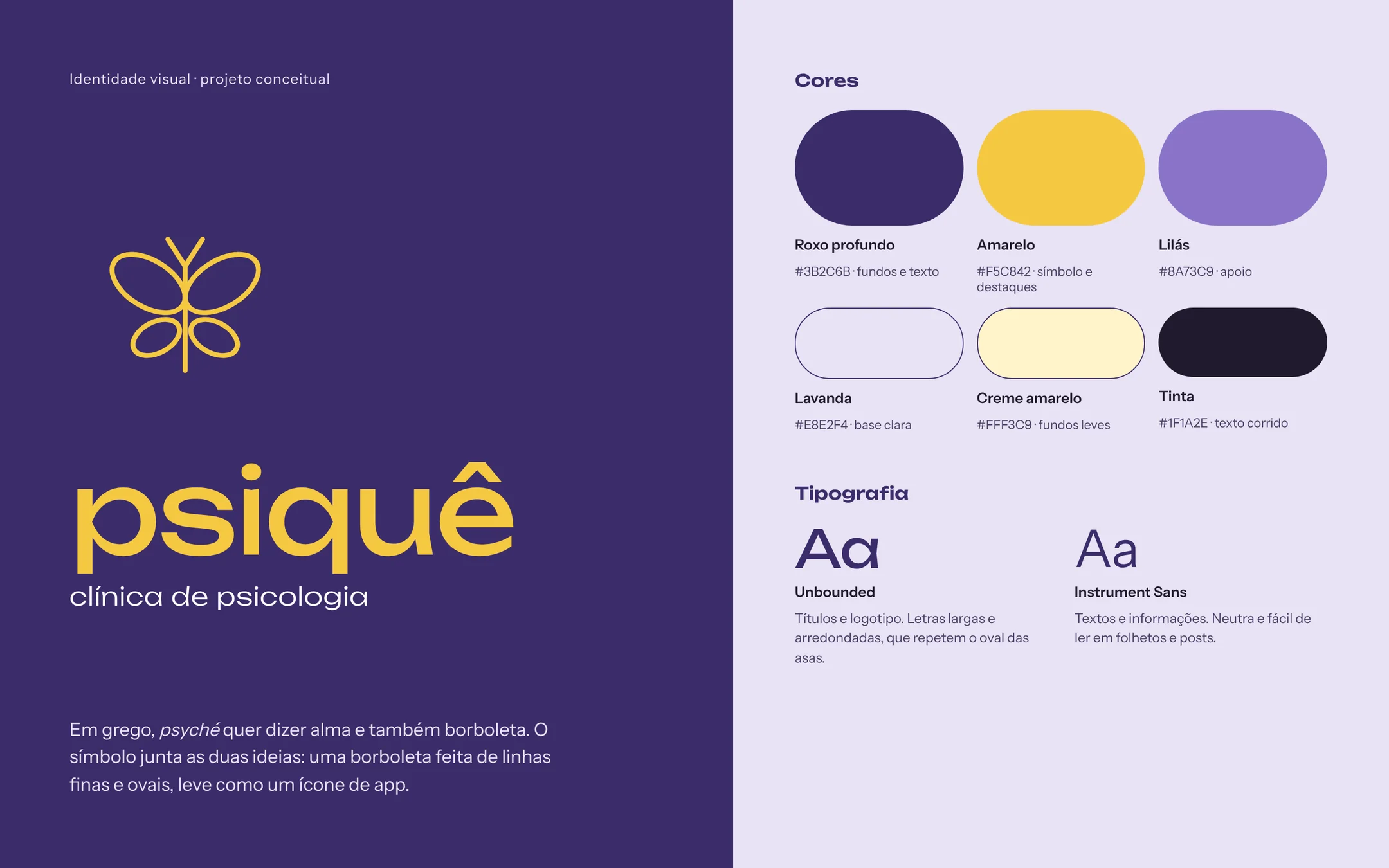
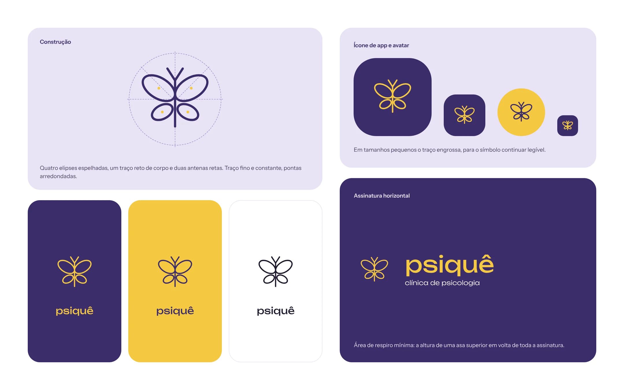
A butterfly, because psyché in Greek means both soul and butterfly. It is made of just four mirrored ellipses and a thin stroke.
- “APP LOOK”
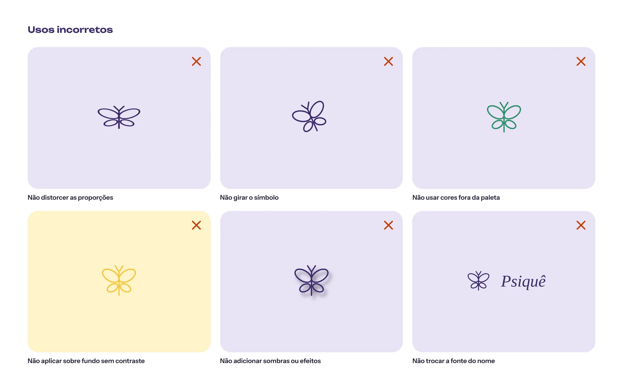
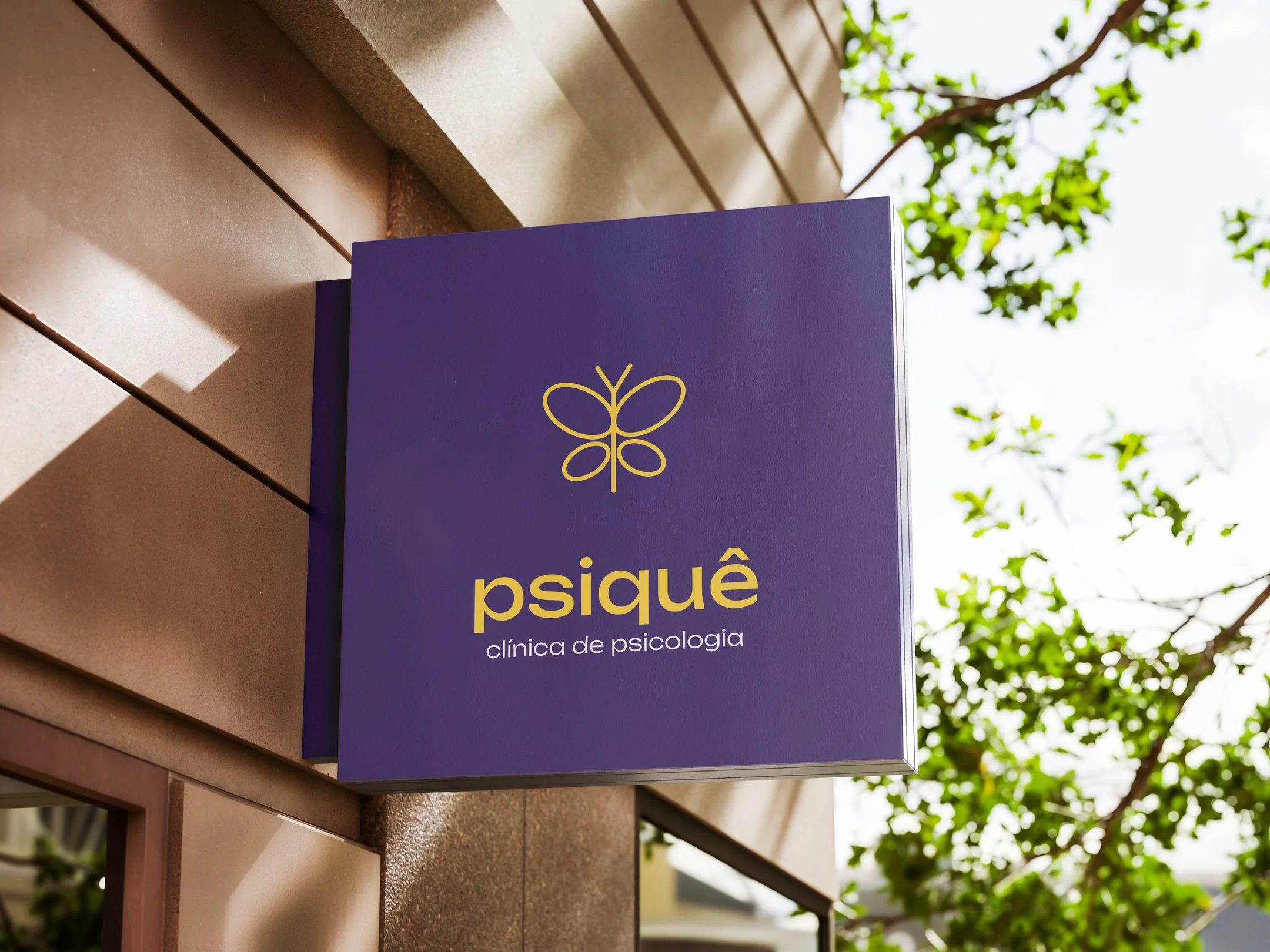
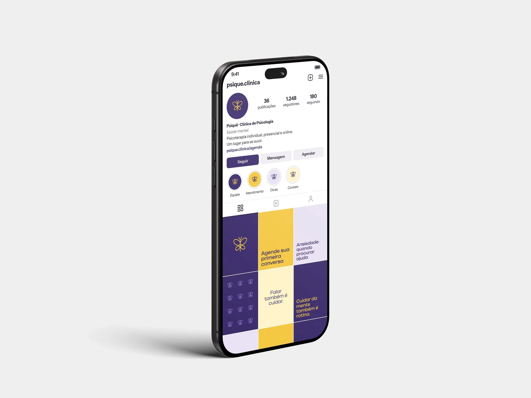
Geometric shapes and few lines that stay legible at small sizes and fit in a rounded square, like an icon on a phone screen.
- COLORS
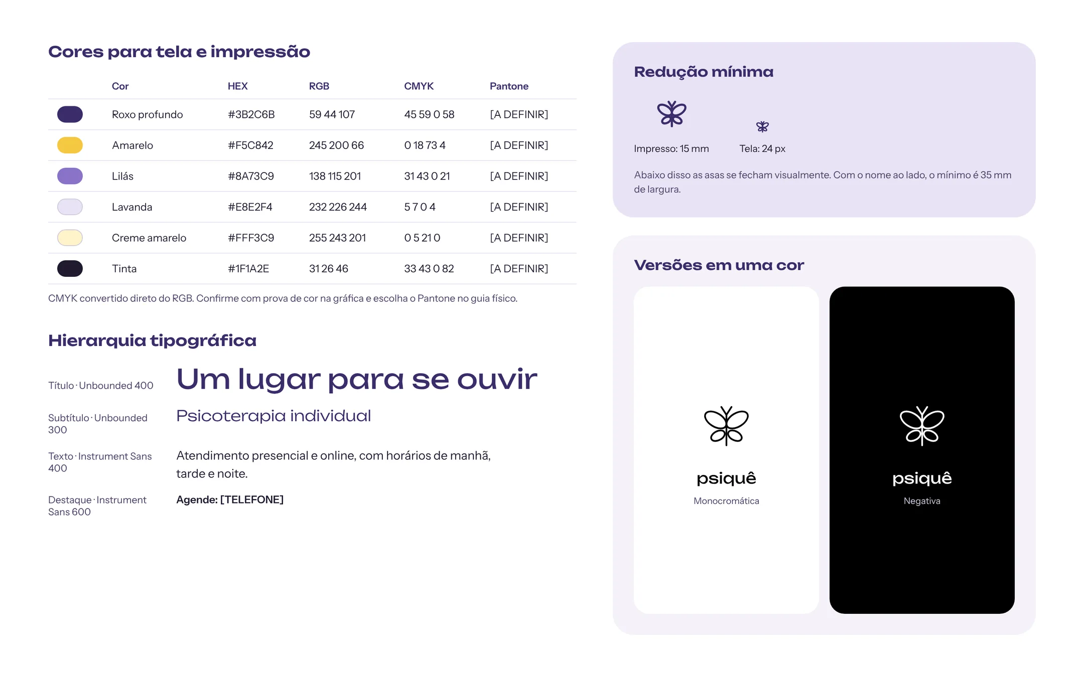
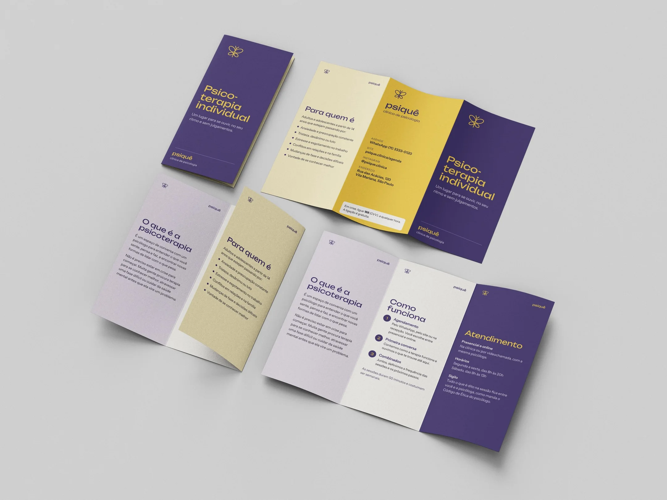
Deep purple as the base and yellow only on the symbol, to stand out without feeling heavy. Lilac, lavender and cream support the pieces.
- TYPE
Unbounded, wide and rounded, for the name; Instrument Sans, simple and easy to read, for the texts.
BRAND
APPLICATIONS
BRAND GUIDELINES